Industrial logo design for D&A Granulation was winning design on 99design contest and what I clearly remember from the brief is that client ask for splash effect. It was crucial to present granulation process like splash of water drops all over the place.
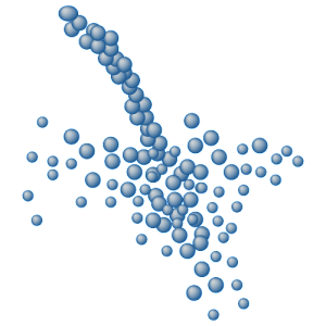 So, what else could we do then to find out the way to make that happen and at the same time to look good. We create a single rounded shape, add gradient to it and then multiply. By recreating the scenery of water pouring into glass job was almost done. Only problem was with gradients and one colored version.
Solutions was that pictorial element can be used and will be only and only in colored mode. Not so good?!?
Questions still remains. How to fix gradient color issues in one colored version logos?
Maybe answer is in the rest of the logo in the wording itself so that word can help the viewer.